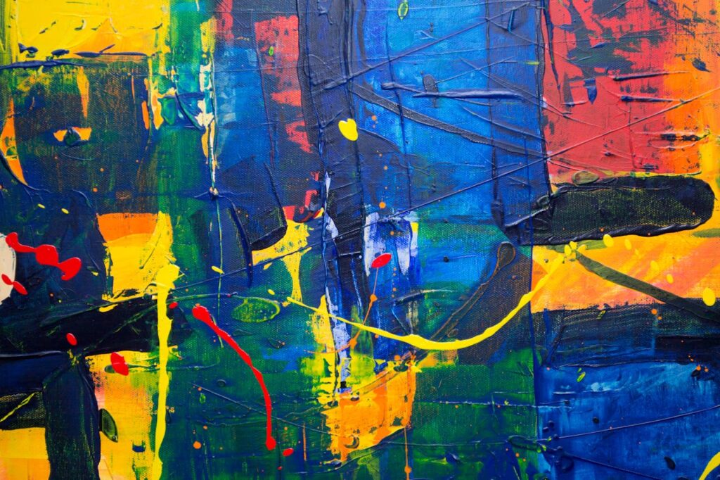
Colors are an integral part of our world, influencing everything from our emotions to our perceptions of beauty and functionality. They play a crucial role in various aspects of life, including art, design, fashion, and even psychology. In this comprehensive guide, we’ll explore a variety of colors, their meanings, and their uses, and provide insights into how these hues are represented in a crossword puzzle we’ve created for you.
1. The Basics of Color Theory
1.1. What is Color Theory?
Color theory is a fundamental aspect of design and art that explores how colors interact, complement, and contrast with each other. It is essential for creating visually appealing and harmonious designs. The theory helps artists and designers understand how to mix colors effectively and create color schemes that are both pleasing and functional.
1.2. The Color Wheel and Its Components
The color wheel is a visual representation of colors arranged according to their chromatic relationship, including primary, secondary, and tertiary hues. The primary colors—red, blue, and yellow—serve as the foundation for creating secondary colors like green, orange, and purple. Tertiary colors are formed by mixing a primary color with a secondary color, resulting in hues such as teal and chartreuse. Understanding the color wheel is crucial for mastering color theory and applying it in various design contexts.
2. Understanding Colors: Shades, Tints, and Hues
2.1. What Are Shades, Tints, and Hues?
To grasp the full spectrum of colors, it’s essential to understand the distinctions between shades, tints, and hues. Hues are the pure colors on the color wheel, such as cobalt blue and fuchsia. Shades are created by adding black to a hue, resulting in darker tones like navy and maroon. Tints are formed by adding white to a hue, producing lighter variations like peach and lavender. Each of these elements plays a unique role in color design and has different applications in art and fashion.
2.2. Exploring Shades: Darkening the Palette
Shades are created by adding black to a color, resulting in deeper tones that can add richness and depth to designs. For example, a shade of blue like navy is often used to convey professionalism and stability, while a shade of red like maroon can evoke a sense of luxury and sophistication. By manipulating shades, designers can create contrast and emphasis, enhancing the visual impact of their work.
2.3. The Role of Tints: Lightening Up
Tints are achieved by adding white to a color, producing lighter variations that can create a sense of airiness and softness. For instance, lavender, a tint of purple, is often associated with calmness and serenity, making it a popular choice for spaces intended to promote relaxation. Similarly, peach, a tint of orange, adds warmth and friendliness to designs. Tints can be used to balance out strong colors and create a harmonious color scheme.
2.4. Hues: The Purest Form of Color
Hues are the pure, undiluted forms of color, such as cerulean blue and magenta. These colors are the building blocks of color theory and serve as the basis for creating shades and tints. Hues are often used to set the mood and tone of a design. For example, the hue of emerald green can evoke a sense of freshness and vitality, while the hue of crimson red can convey passion and intensity. Understanding and utilizing hues effectively can significantly enhance the visual appeal of any project.
3. Color in Nature and Its Significance
3.1. Natural Inspirations: From Emerald Forests to Amber Landscapes
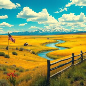
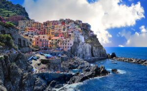
Nature provides an endless source of color inspiration, with natural hues ranging from the deep greens of emerald forests to the golden browns of amber. These colors are not only beautiful but also carry symbolic meanings. For example, emerald green is often associated with growth and renewal, while amber yellow evokes warmth and energy. By drawing inspiration from nature, designers can create designs that are both aesthetically pleasing and meaningful.
3.2. The Symbolism of Colors in the Natural World
Each color in nature carries symbolic meaning, influencing how we perceive and interact with our environment. The calming influence of teal waters can create a sense of tranquility, while the vibrant energy of a sunset can inspire creativity and joy. Understanding the symbolism of colors can help designers make informed choices about color usage and create designs that resonate with their audience on a deeper level.
4. Color in Art and Design
4.1. Historical Uses of Color in Art
Throughout history, artists have employed colors like ochre and cobalt to convey emotions and create visual impact. Ochre, a natural earth pigment, has been used in art since prehistoric times to create rich, warm tones. Cobalt blue, a synthetic pigment developed in the 19th century, has become a staple in modern art for its vibrant and stable hue. Exploring the historical uses of color can provide valuable insights into the evolution of artistic techniques and styles.
4.2. Modern Color Trends and Their Impact
Contemporary design trends often feature bold colors such as turquoise and magenta, influencing everything from fashion to interior decor. These vibrant colors are used to make a statement and create visual interest. For example, turquoise is often used in modern interiors to add a refreshing and dynamic touch, while magenta can be used in fashion to create eye-catching and trendy designs. Understanding current color trends can help designers stay relevant and create designs that appeal to contemporary tastes.
5. Color in Fashion and Personal Expression
5.1. The Psychology of Color in Clothing
Colors like scarlet and black are used in fashion to evoke specific feelings and make statements about personal style. Scarlet, a bright and bold color, can convey confidence and power, while black, often associated with elegance and sophistication, is a versatile and timeless choice. By understanding the psychology of color, individuals can make informed decisions about their clothing and use color to express their personality and enhance their overall appearance.
5.2. The Influence of Color on Trends and Preferences
Fashion trends are often driven by popular colors, with shades like lime and rose making significant impacts on seasonal collections. Lime green, a vibrant and energetic color, is frequently seen in summer collections, while rose pink adds a touch of romance and femininity to designs. By keeping up with color trends, designers and fashion enthusiasts can stay ahead of the curve and create stylish and on-trend looks.
6. Practical Applications of Color
6.1. Choosing Colors for Home Decor
Selecting the right colors for home decor can transform a space, with options ranging from soothing lavender to bold chartreuse. Lavender, with its soft and calming qualities, is ideal for creating a relaxing atmosphere in bedrooms and living rooms. Chartreuse, a bright and energetic color, can be used to add a pop of color to more vibrant spaces. By carefully choosing colors, individuals can create a home environment that reflects their personal style and enhances their well-being.
6.2. The Role of Color in Branding and Marketing
In branding, colors like silver and gold are utilized to convey luxury and sophistication, influencing consumer perception. Silver, associated with elegance and modernity, is often used in high-end products and luxury brands. Gold, with its connotations of wealth and prestige, is frequently used to create a sense of opulence and exclusivity. Understanding the role of color in branding can help businesses effectively communicate their brand identity and attract their target audience.
7. Embracing the Spectrum: Enhancing Your Color Knowledge
Understanding the rich variety of colors and their applications enhances our appreciation of art, design, and everyday life. By exploring the spectrum of hues and their uses, we gain insights into how colors influence our world and our experiences. We hope this guide has expanded your color knowledge and inspired you to explore the world of hues further, both in theory and in practice.
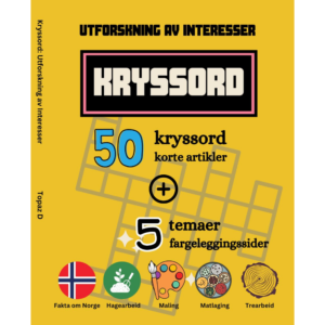
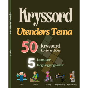
To test your knowledge of colors, we’ve created a crossword puzzle featuring many of the hues discussed in this article. This interactive activity is designed to reinforce your understanding of colors and provide a fun way to engage with the topic.


 Jigsaw Puzzles
 Jigsaw Puzzles
 Jigsaw Puzzles